Types
CameraConfig
The camera configuration for virtual camera detection
type CameraConfig = {
  virtualLabel: string[];
};
Properties:
| Name/Path | Type | Description |
|---|---|---|
| virtualLabel | string[] | An array of substrings for virtual camera detection to test against |
CompressionAlgorithm
Image compression algorithm parameters
type CompressionAlgorithm = {
  dimension: ImageDimension,
  fileSizeThreshold: number,
  qualityThreshold?: number,
};
Properties:
| Name/Path | Type | Description |
|---|---|---|
| dimension | ImageDimension | The preffered photo dimension |
| fileSizeThreshold | number | Maximum photo size |
| qualityThreshold | number | undefined | Minimum photo quality in percentage |
Credential
The credential configuration for generating image hash for authenticity check
type Credential = {
  clientId: string;
  secret: string;
};
Properties:
| Name/Path | Type | Description |
|---|---|---|
| clientId | string | The client id to be included for image hashing |
| secret | string | The secret for image hashing |
Endpoint
An endpoint specification
type Endpoint = {
  headers: Record<any, any>;
  params: Record<any, any>;
  url: Url;
};
Properties:
| Name/Path | Type | Description |
|---|---|---|
| headers | Record<any, any> | The custom header field to be sent together |
| params | Record<any, any> | The query parameter field to be sent together |
| url | Url | The url destination |
ImageDimension
Image dimension array of 2 numbers, width and height respectively
type ImageDimension = [number, number];
Instruction
The instruction type
type Instruction =
  | 'look_left'
  | 'look_right'
  | 'open_mouth'
  | 'see_straight';
Values:
| Value | Description |
|---|---|
| look_left | Look left instruction |
| look_right | Look right instruction |
| open_mouth | Open mouth instruction |
| see_straight | See straight instruction |
Info
For content of running verification screen illustration, please check
Builder.setInstruction.
InstructionOptions
Active liveness parameters
type InstructionOptions = {
  commands: Instruction[];
  seedLimit: number;
  translator: Record<Instruction, string>;
  illustrator: Record<Instruction, string>;
  isShowInstruction: boolean;
  isSoundLooping: boolean;
  isUseSound: boolean;
  speaker: Record<Instruction, string>;
};
Properties:
| Name/Path | Type | Description |
|---|---|---|
| commands | Instruction[] | Instructions to be appended at the end of random generated instructions |
| seedLimit | number | Random instruction count to be generated |
| translator | Record<Instruction, string> | Instruction text to be shown according to each instructions |
| illustrator | Record<Instruction, string> | Instruction image to be shown according to each instructions |
| isShowInstruction | boolean | Hide instruction text if true |
| isSoundLooping | boolean | Loop instruction sound if true |
| isUseSound | boolean | Play instruction sound if true |
| speaker | Record<Instruction, string> | Instruction sound to be played according to each instructions |
Info
For content of running verification screen illustration, please check
Builder.setInstruction.
InstructionPageContent
Instruction page content configuration
type InstructionPageContent = {
  title: string;
  subtitle: string;
  instructions: Array<{
    caption: string;
    image: string;
  }>;
  action: {
    backIcon: string;
    start: string;
    next: string;
  };
};
Properties:
| Name/Path | Type | Description |
|---|---|---|
| title | string | The title text |
| subtitle | string | The subtitle text below the title text |
| instructions | object[] | The instruction contents on the instruction page |
| instructions[number].caption | string | The instruction image caption |
| instructions[number].image | string | The instruction image url |
| action | object | The instruction page action button content configurations |
| action.backIcon | string | The back icon image url |
| action.start | string | The start button text |
| action.next | string | The next button text |
Images:
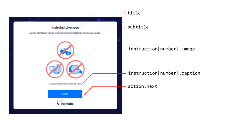
Instruction content names/paths on first instruction
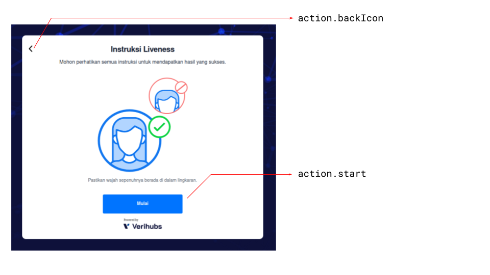
Instruction content names/paths on last instruction
Note
- The back icon is only visible on the second to the last instruction of the
instruction page.- The next button is only visible on the first to the second last instruction,
while the start button is only visible on the last instruction.
InstructionPageTheme
Instruction page theme configuration
type InstructionPageTheme = {
  frameContainer: {
    backgroundColor: string;
  };
  title: {
    color: string;
    fontSize: string;
  };
  subtitle: {
    color: string;
    fontSize: string;
  };
  figcaption: {
    color: string;
    fontSize: string;
  };
  action: {
    start: {
      color: string;
      fontSize: string;
      backgroundColor: string;
      hover: {
        backgroundColor: string;
      };
    };
    next: {
      color: string;
      fontSize: string;
      backgroundColor: string;
      hover: {
        backgroundColor: string;
      };
    };
  };
};
Properties:
| Name/Path | Type | Description |
|---|---|---|
| frameContainer | object | The page frame container style |
| frameContainer.backgroundColor | string | The page frame container background color |
| title | object | The title style |
| title.color | string | The title font color |
| title.fontSize | string | The title font size |
| subtitle | object | The subtitle style |
| subtitle.color | string | The subtitle font color |
| subtitle.fontSize | string | The subtitle font size |
| figcaption | object | The figcaption style |
| figcaption.color | string | The figcaption font color |
| figcaption.fontSize | string | The figcaption font size |
| action | object | The action styles |
| action.start | object | The start action button style |
| action.start.color | string | The start action button font color |
| action.start.fontSize | string | The start action button font size |
| action.start.backgroundColor | string | The start action button background color |
| action.start.hover | object | The start action button hover style |
| action.start.hover.backgroundColor | string | The start action button background color when hovered |
| action.next | object | The next action button style |
| action.next.color | string | The next action button font color |
| action.next.fontSize | string | The next action button font size |
| action.next.backgroundColor | string | The next action button background color |
| action.next.hover | object | The next action button hover style |
| action.next.hover.backgroundColor | string | The next action button background color when hovered |
Images:
Instruction theme names/paths on first instruction
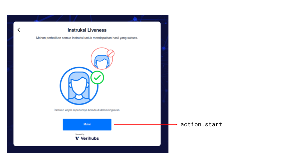
Instruction theme names/paths on first instruction
Note
- The back icon is only visible on the second to the last instruction of the
instruction page.- The next button is only visible on the first to the second last instruction,
while the start button is only visible on the last instruction.
LivenessContentConfiguration
The Liveness WebSDK content configuration
type ContentConfiguration = {
  Instruction: InstructionPageContent;
  Verification: VerificationPageContent;
  Result: ResultPageContent;
};
Properties:
| Name | Type | Description |
|---|---|---|
| Instruction | InstructionPageContent | Instruction page content configuration |
| Verification | VerificationPageContent | Verification page content configuration |
| Result | ResultPageContent | Result page content configuration |
LivenessSDK
The Liveness WebSDK instance
type LivenessSDK = {
  onStart: (hideFrame?: boolean) => void;
  onDestroy: () => void;
};
Methods:
| Name/Path | Type Signature | Description |
|---|---|---|
| onStart | (hideFrame?: boolean) => void | Shows and starts the Liveness WebSDK |
| onDestroy | () => void | Stops and remove the Liveness WebSDK |
Shows and starts the Liveness WebSDK
onStart(hideFrame?: boolean): void;
Parameters:
| Name | Type | Description |
|---|---|---|
| hideFrame | boolean | undefined | Hides the Liveness WebSDK if true. |
Stops and remove the Liveness WebSDK
onDestroy(): void;
LivenessThemeConfiguration
The Liveness WebSDK theme configuration
type LivenessThemeConfiguration = {
  Component: {
    Instruction: InstructionPageTheme;
    Verification: VerificationPageTheme;
    Result: ResultPageTheme;
    Shared: SharedTheme;
  };
  Palette: ThemePalette;
  Typography: TypographyPalette;
  VendorPlaceholder: boolean;
};
Properties:
| Name/Path | Type | Description |
|---|---|---|
| Component | object | All page theme configurations |
| Component.Instruction | InstructionPageTheme | Instruction page theme configuration |
| Component.Verification | VerificationPageTheme | Verification page theme configuration |
| Component.Result | ResultPageTheme | Result page theme configuration |
| Component.Shared | SharedTheme | Shared theme configuration |
| Palette | PaletteTheme | Global palette configuration |
| Typography | TypographyTheme | Global typography configuration |
| VendorPlaceholder | boolean | Global vendor placeholder configuration |
Palette
A color palette for theming
type Palette = {
  contrastText: string;
  default: string;
  LIGHT: string;
  DARK: string;
};
Properties:
| Name/Path | Type | Description |
|---|---|---|
| contrastText | string | Usually for button text color |
| default | string | Primary color for the palette |
| LIGHT | string | Lighter version of the default color |
| DARK | string | Lightest version of the default color |
PaletteTheme
Global palette configuration
type PaletteTheme = {
  primary: Palette;
  secondary: Palette;
};
Properties:
ProxyMiddleware
Endpoint specification collection for the Liveness WebSDK
type ProxyMiddleware = {
  License: Endpoint;
  PassiveLiveness: Endpoint;
  GenerateKey?: Endpoint;
};
Properties:
ResultPageContent
Result page content configuration
type ResultPageContent = {
  icon: string;
  description: string;
};
Properties:
| Name/Path | Type | Description |
|---|---|---|
| icon | string | The result icon image url |
| description | string | The result description text |
Images:
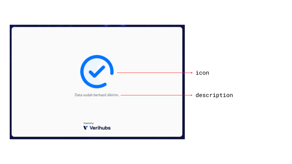
Result content names/paths
ResultPageTheme
Result page theme configuration
type ResultPageTheme = {
  frameContainer: {
    backgroundColor: string;
  };
  description: {
    color: string;
    fontSize: string;
  };
};
Properties:
| Name/Path | Type | Description |
|---|---|---|
| frameContainer | object | The page frame container style |
| frameContainer.backgroundColor | string | The page frame container background color |
| description | object | The description style |
| description.color | string | The description font color |
| description.fontSize | string | The description font size |
Images:
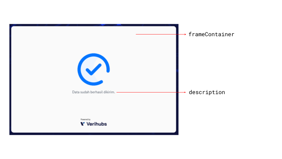
Result theme names/paths
SharedTheme
Shared theme configuration
type SharedTheme = {
  background: {
    backgroundColor: string;
    backgroundImage: string;
    backgroundSize: string;
  };
};
Properties:
| Name/Path | Type | Description |
|---|---|---|
| background | object | The background style |
| background.backgroundColor | string | The background color |
| background.backgroundImage | string | The background image url |
| background.backgroundSize | string | The background size |
ScreenOrientation
The orientation for photo output
type ScreenOrientation =
  | 'auto'
  | 'landscape'
  | 'portrait';
Values:
| Value | Description |
|---|---|
| auto | Automatically detect current screen orientation |
| landscape | Force landscape |
| portrait | Force portrait |
Url
Url string
type Url = string;
VerificationPageContent
Verification page content configuration
type VerificationPageContent = {
  title: string;
  action: {
    backIcon: string;
  };
  instruction: {
    loading: {
      caption: string;
      image: string;
      sound: string;
    };
    processing: {
      caption: string;
      image: string;
      sound: string;
    };
  };
};
Properties:
| Name/Path | Type | Description |
|---|---|---|
| title | string | The title text |
| action | object | The verification page action button content configurations |
| action.backIcon | string | The back icon image url |
| instruction | object | The status content configurations |
| instruction.loading | object | The loading status content configuration |
| instruction.loading.caption | string | The loading status caption |
| instruction.loading.image | string | The loading status image url |
| instruction.loading.sound | string | The loading status sound url |
| instruction.processing | object | The processing status content configuration |
| instruction.processing.caption | string | The processing status caption |
| instruction.processing.image | string | The processing status image url |
| instruction.processing.sound | string | The processing status sound url |
Images:
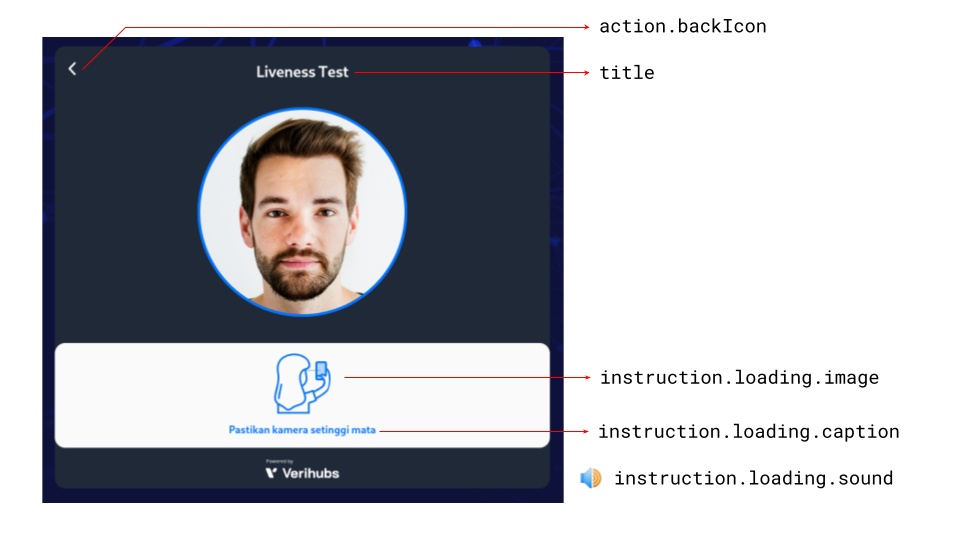
Verification content names/paths on loading verification
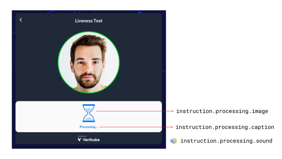
Verification content names/paths on processing/final verification
Note
- The loading verification screen will only be shown when the active
liveness model is loading.- The processing/final verification screen will only be shown when the
active liveness model is finished and the passive liveness model is
running.
Info
For content of running verification screen illustration, please check
Builder.setInstruction.
VerificationPageTheme
Verification page theme configuration
type VerificationPageTheme = {
  frameContainer: {
    backgroundColor: string;
  };
  title: {
    color: string;
    fontSize: string;
  };
  camera: {
    initial: {
      borderColor: string;
    };
    undetected: {
      borderColor: string;
    };
    detected: {
      borderColor: string;
    };
  };
  instruction: {
    backgroundColor: string;
    color: string;
    fontSize: string;
  };
};
Properties:
| Name/Path | Type | Description |
|---|---|---|
| frameContainer | object | The page frame container style |
| frameContainer.backgroundColor | string | The page frame container background color |
| title | object | The title style |
| title.color | string | The title font color |
| title.fontSize | string | The title font size |
| camera | object | The camera preview style |
| camera.initial | object | The camera preview initial style |
| camera.initial.borderColor | string | The camera preview initial border color |
| camera.undetected | object | The camera preview style when face is undetected |
| camera.undetected.borderColor | string | The camera preview border color when face is undetected |
| camera.detected | object | The camera preview style when face is detected |
| camera.detected.borderColor | string | The camera preview border color when face is detected |
| instruction | object | The instruction section style |
| instruction.backgroundColor | string | The instruction section background color |
| instruction.color | string | The instruction section font color |
| instruction.fontSize | string | The instruction section font size |
Images:
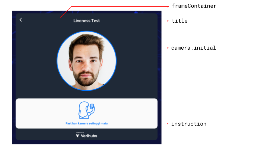
Verification theme names/paths on loading verification with initial border color
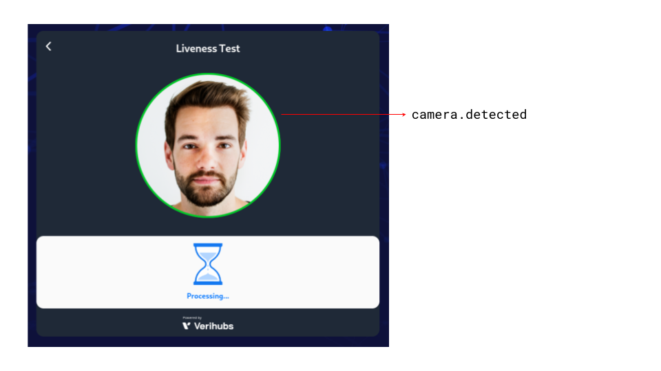
Verification theme names/paths on processing/final verification with face detected border color
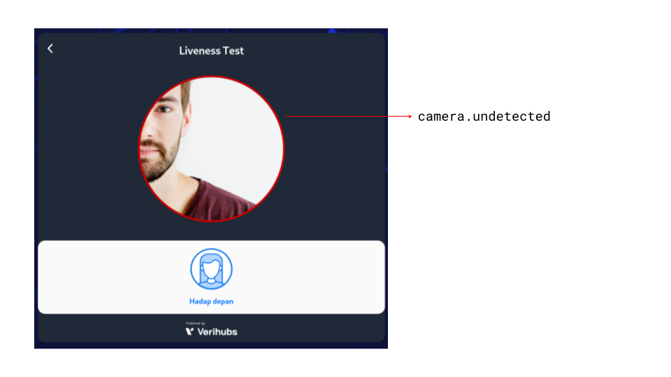
Verification theme names/paths on running verification with undetected face border color
Note
The loading verification screen will only be shown when the active liveness model is loading.
The processing/final verification screen will only be shown when the active liveness model is finished and the passive liveness model is running.
The running verification screen will only be shown when the active liveness model is running.
The initial border color will only be shown when the active liveness model is loading.
The detected border color will only be shown when the face is fully detected by the active liveness.
The undetected border color will only show when:
- the full face is not detected after the full face was detected (i.e the full face was detected, then pulled out) within 3 seconds after the model is loaded, or
- the full face was never detected after the model is loaded.
When the full face is not detected after a successful full face detection and 3 seconds after the model is loaded, message
Verification.Disrupted
Info
For content of running verification screen illustration, please check
Builder.setInstruction.
TypographyTheme
Global typography configuration
type TypographyTheme = {
  fontFamily: string[];
  fontSize: {
    title: string;
    body: string;
    caption: string;
    button: string;
  };
};
Properties:
| Name/Path | Type | Description |
|---|---|---|
| fontFamily | string[] | An array of font family. Uses the first one. If not available, uses the next one. |
| fontSize | object | Text font size variations |
| fontSize.title | string | Title text font size |
| fontSize.body | string | Body text font size |
| fontSize.caption | string | Caption text font size |
| fontSize.button | string | Button text font size |
Updated about 2 months ago